


website redesign — a C/COCA case study

Website Redesign + Admin System

AROUSE is Ohio State's student-run radio station. C/COCA brought together students from across Columbus to redesign its website and build a custom admin system so its student leaders could update content themselves.

We did it for free.

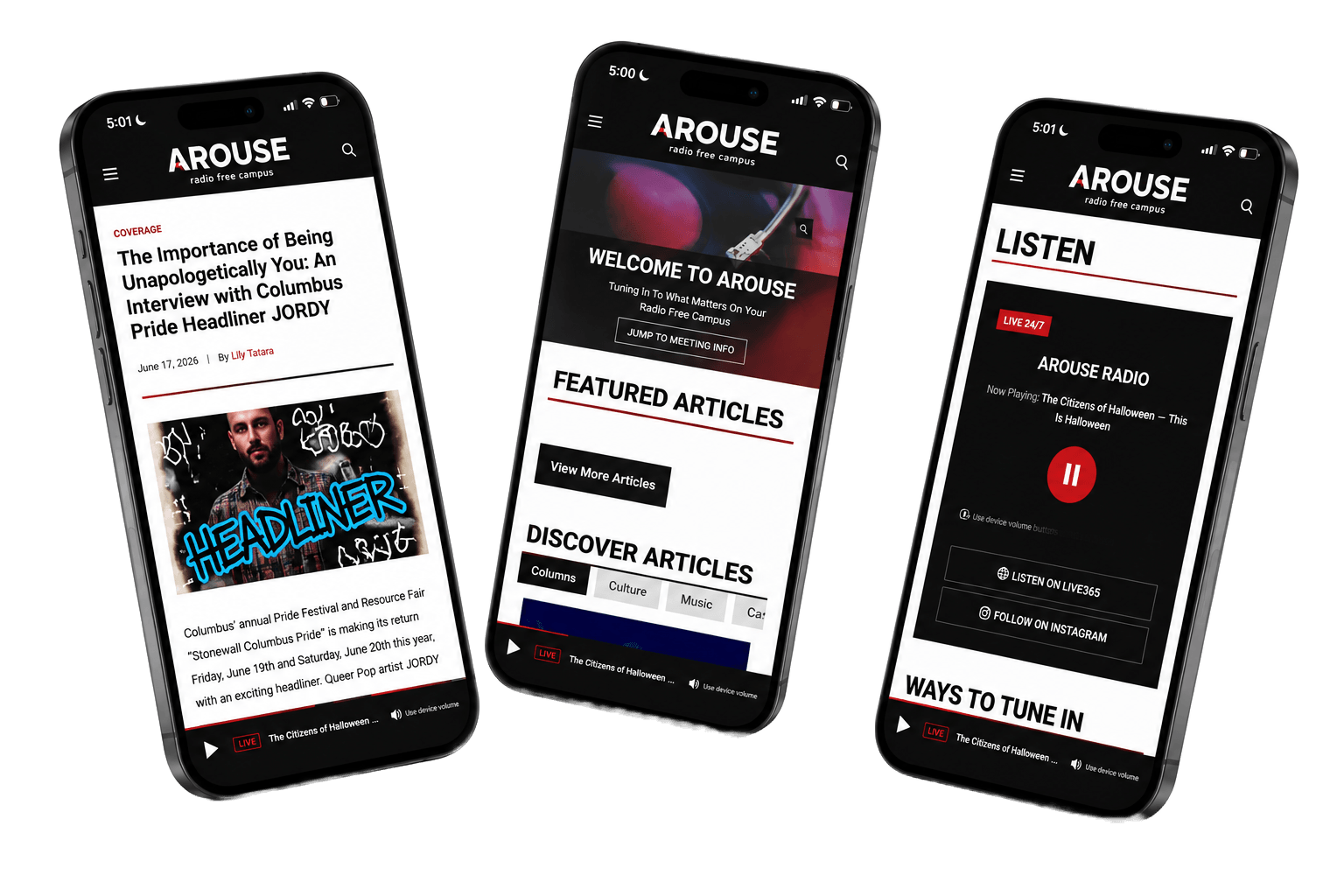
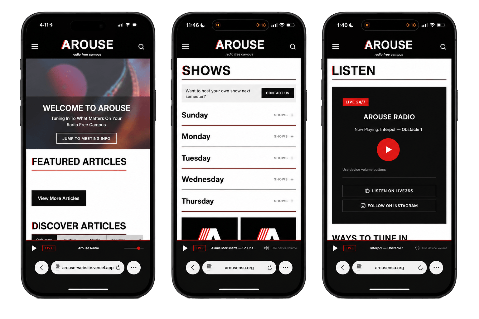
The new AROUSE website on three phones: the homepage, the Shows page and the Listen page.

Before and after

Scroll through and compare AROUSE's original homepage with the redesign. Drag the slider to see what changed. Switch between AROUSE's original homepage and the redesign to see what changed.

The redesigned AROUSE homepage, full page: a turntable hero with the welcome message, Featured Articles, Discover Articles with category tabs, a photo carousel, Next Meeting Details, a Help Us Improve and Grow call to support, and the footer.
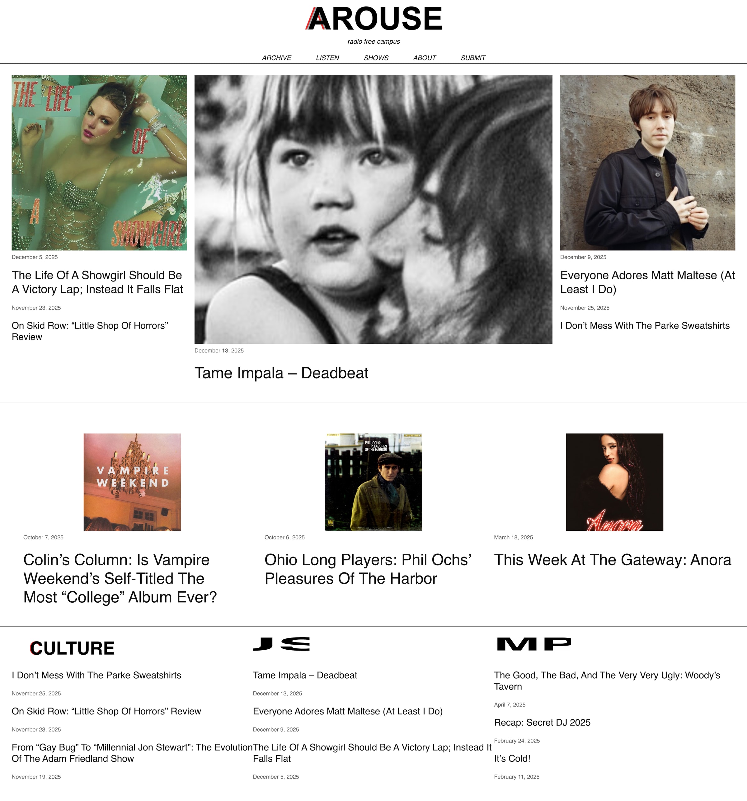
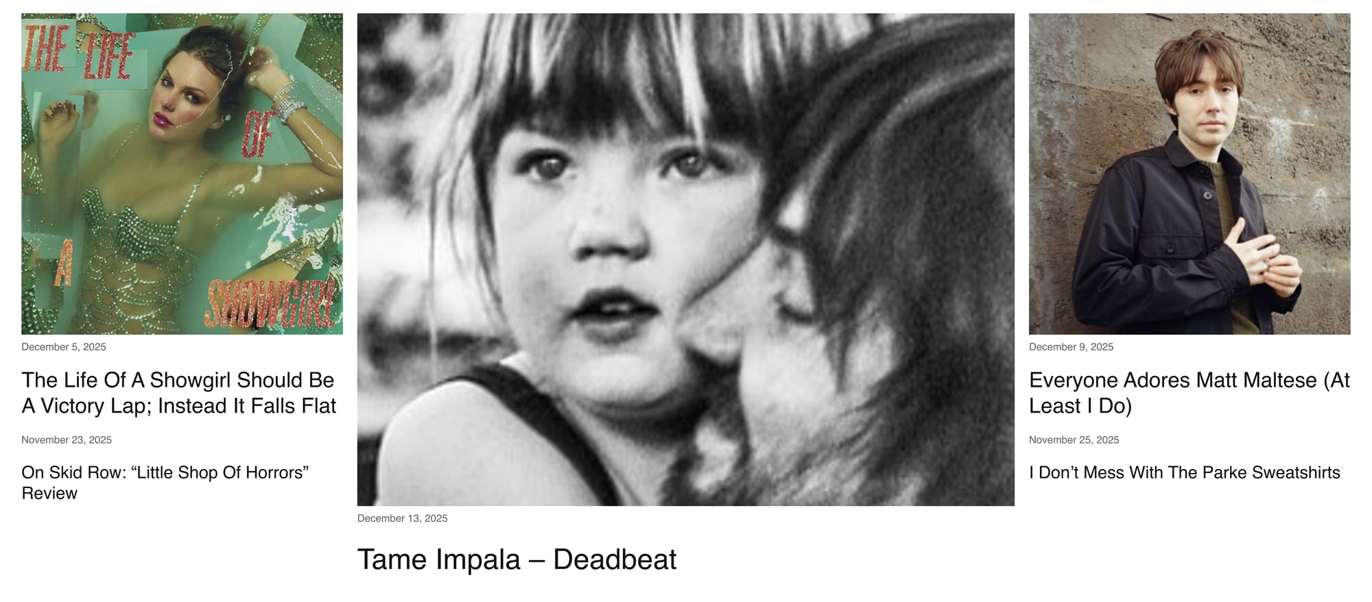
The original AROUSE homepage, full page: a centered wordmark and nav, a three-column grid of photos and headlines, a row of article cards, and text lists of recent articles.

Overview

  • Student-Led Radio

    C/COCA redesigned and developed AROUSE's website, bringing its articles, radio shows, and organization information together.

  • 6 Developers

    Built the website and its features.

  • 2 Designers

    Created the initial designs and revised them with feedback from AROUSE.

  • Impact

    AROUSE now uses and maintains the website at no cost.

What Did We Do?

AROUSE homepage on iPhone: Welcome to AROUSE, Featured Articles and Discover Articles
1 / 3

Design System & Inspiration

Looking at Other Music Websites

We looked at Pitchfork and ACRN, Ohio University's student radio station, while working on the initial designs.

Both websites had things we liked. ACRN used a strong editorial layout to organize its articles, while Pitchfork gave photographs and headlines plenty of space. We wanted to bring some of those ideas into AROUSE's website without making it look like a copy of either one.

Salma created the initial Figma pages and established the design system, including the typography, colors, and layouts used throughout the redesign.

1 / 3
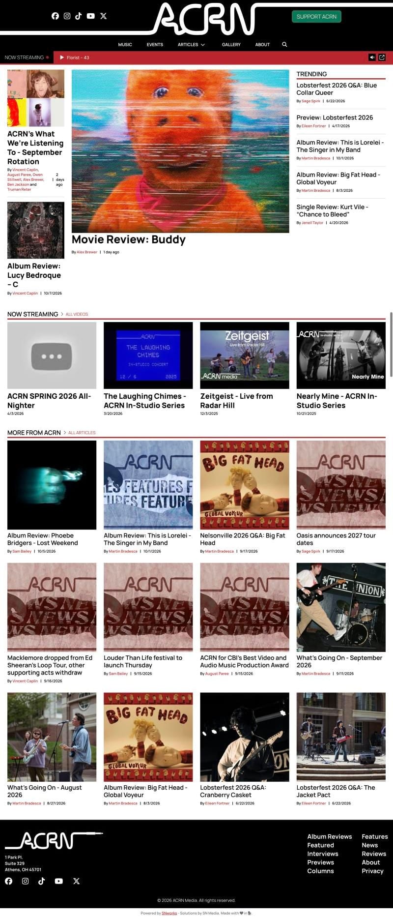
Full-page screenshot of the ACRN homepage: a black masthead with an oversized wordmark, a red Now Streaming bar, a large lead photo with a Trending list, a row of video cards, a four-column grid of article cards, and a black footer.
  1. Black masthead

    ACRN uses a black header with a large wordmark and a simple navigation menu. We also used a black header for AROUSE, keeping its logo prominent.

  2. Editorial grid

    ACRN places a large featured story alongside smaller articles. The different image sizes help distinguish the main story from the rest. AROUSE's homepage also gives featured articles their own section.

  3. Image-first article cards

    ACRN uses consistent article cards with a photograph, headline, byline, and date. We used a similar approach for AROUSE's Discover Articles section.

Color system

  • AROUSE Red

    #D71920

  • Black

    #0A0A0A

  • White

    #FFFFFF

Typography

Helvetica: Display text and headlines

AROUSE

Inter: Body text and interface elements

Articles, reviews, playlists, and live radio from Ohio State's student-run station.

What We Identified

Reviewing AROUSE's original website, three issues stood out.

1 / 3

Poor Typography

The original website used large, capitalized section headings, but article titles had much less emphasis. Dates were also displayed in very small gray text.

The difference between headings, article titles, and supporting information wasn't always clear, which made the articles harder to scan.

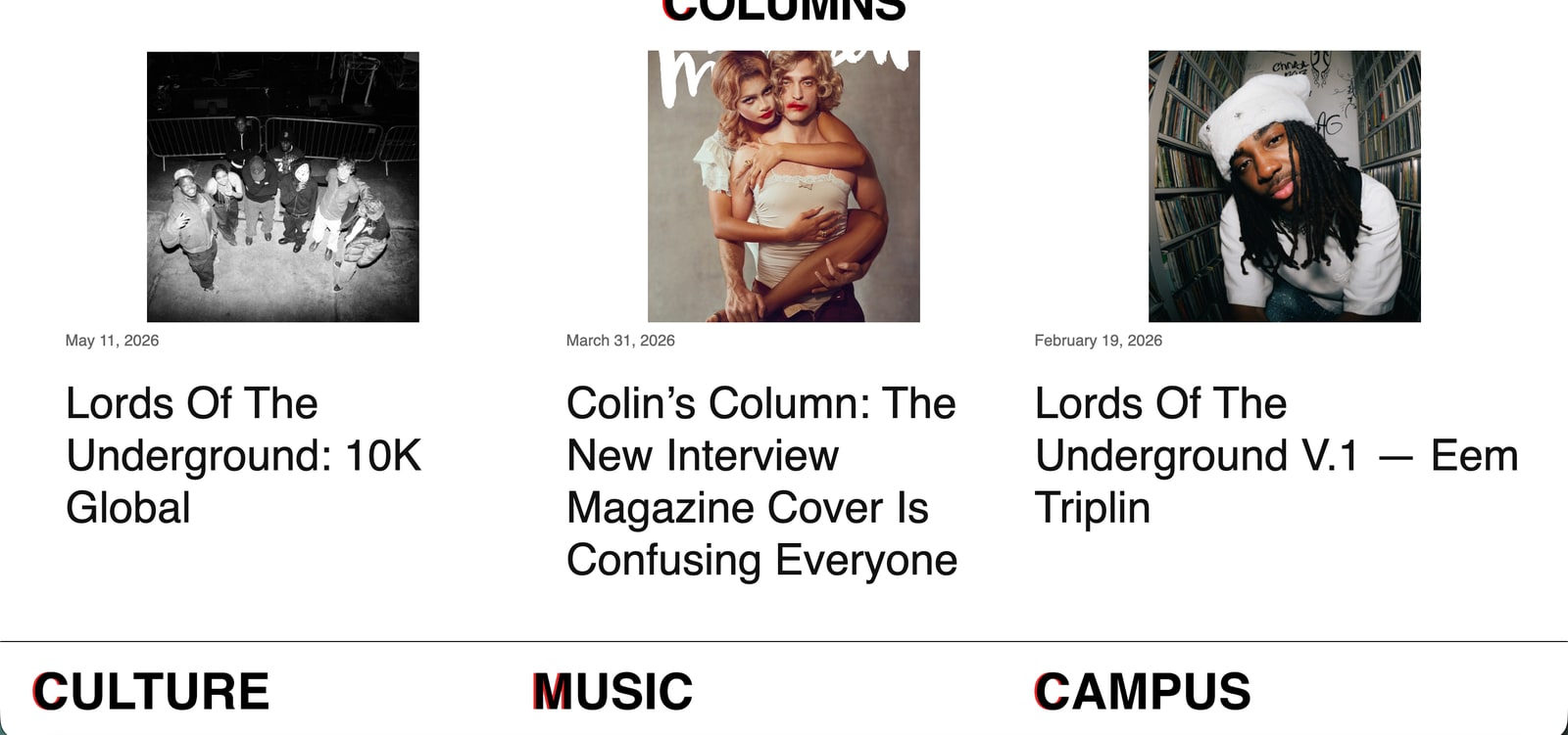
A section of the original AROUSE homepage: three article cards with very small dates and plain headlines (Lords Of The Underground: 10K Global; Colin’s Column: The New Interview Magazine Cover Is Confusing Everyone; Lords Of The Underground V.1 — Eem Triplin), above a rule and three heavy capitalised headings, Culture, Music and Campus, each with a red first letter.

The Challenge

A Website for Everything AROUSE Does

AROUSE publishes articles and reviews, hosts live radio shows, and organizes events for its members.

Its website needed to support all of those activities while making it easy for someone new to find what they were looking for.

When we spoke with AROUSE's executive board, they also told us they wanted a homepage that felt homey and welcoming.

We focused on four areas.

Music and Writing
Organize articles and reviews into Columns, Culture, Music, and Campus.
Live Radio
Make the Live365 stream accessible while visitors browse other pages.
Shows
Display the weekly schedule of student-hosted radio programs.
Community
Make meeting information and ways to support AROUSE easier to find.

The Initial Designs

Making the Pages More Consistent

The first designs focused on reorganizing AROUSE's existing content and establishing layouts that could be used across the website.

We standardized section headings, adjusted article cards, and used more consistent spacing. We also looked at how information was arranged on individual pages, particularly where there was a lot of text or repeated content.

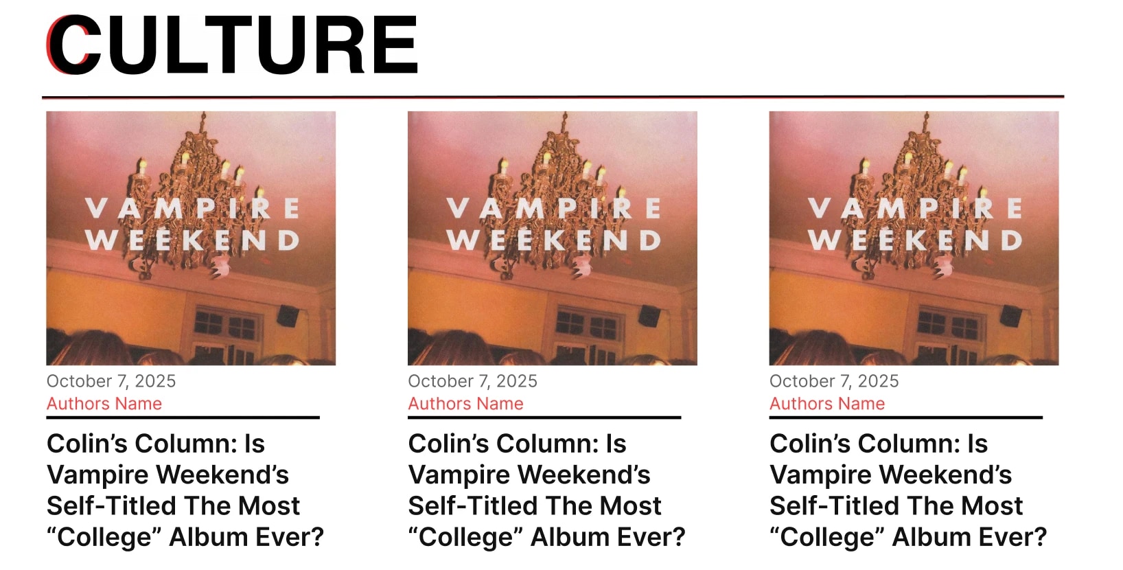
The redesigned Culture section: a left-aligned heading with a red rule above three evenly spaced article cards.

1 / 3

Feedback From AROUSE

What the Executive Board Said

We shared the initial designs with AROUSE's executive board and asked for their feedback.

From
AROUSE e-board
Subject
Notes on the new designs

“We really like the look of things!”

They also sent several suggestions for the homepage.

  • A Spotlight

    They wanted something prominent at the top of the page, whether that was a recent article, the live radio stream, a photograph, or a welcome message.

  • A Welcoming First Screen

    They wanted the homepage to introduce AROUSE to new visitors, including photographs from past events.

  • A Mini Player

    They wanted visitors to be able to listen to the radio from any page.

  • A Donate Button

    They asked for a button linking directly to their PayPal.

We used these requests when planning the next version of the homepage.

Design Evolution

Revising the Homepage

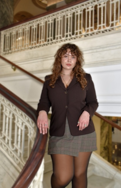
Portrait of Tyler Poole

Designer spotlight

Tyler Poole

After Salma completed the initial designs, Tyler Poole worked on the next round of homepage revisions.

He focused on how articles were organized, what visitors saw when they first opened the website, and how AROUSE could show more of its members and events.

1 / 3

1. Tabbed Article Navigation

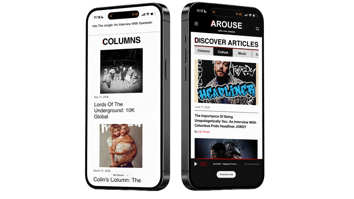
Tyler reorganized Discover Articles into four tabs: Columns, Culture, Music, and Campus.

Instead of scrolling past every category, visitors can select the one they're interested in and browse its articles.

I prioritized straightforward navigation so users can easily jump to the content they want without feeling overwhelmed and needing to scroll quite a bit.
Tyler Poole
Two phones side by side. On the left, the original site lists article after article under a Columns heading. On the right, the redesign shows a Discover Articles heading with tabs for Columns, Culture and Music above a single article card.

Before

Articles appeared in long sections, one after another.

After

Visitors can switch between categories using tabs.

2. A Welcoming Homepage

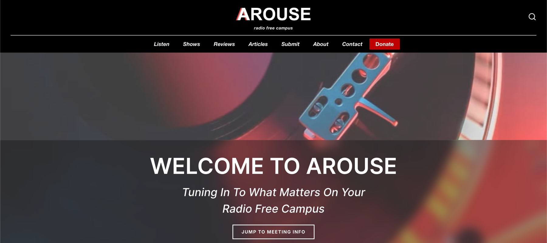
Tyler redesigned the homepage's opening section around a photograph of a turntable, with the welcome message placed over the image.

This gave the homepage a stronger connection to AROUSE's music and radio programming.

The record imagery establishes AROUSE’s musical identity.
Tyler Poole
Tyler Poole's homepage hero: the AROUSE header and navigation over a close photograph of a turntable and tonearm, with the headline Welcome to AROUSE, the line Tuning In To What Matters On Your Radio Free Campus, and a Jump to meeting info button.

3. Past Events Slideshow

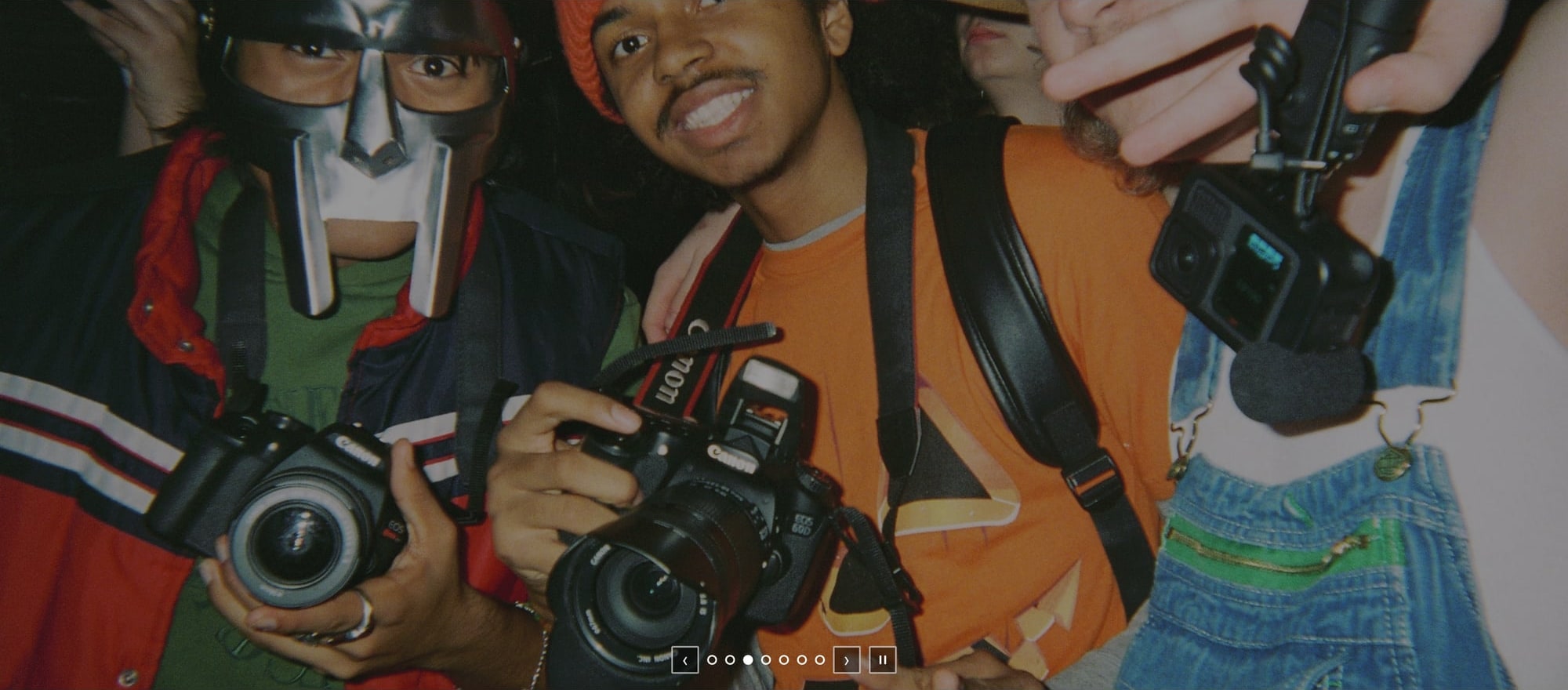
Tyler also added a slideshow of photographs from past AROUSE events below the article section.

Visitors can move between the photographs using the slideshow controls. It gives people who are unfamiliar with AROUSE a chance to see its members and activities.

The photo slideshow on the live AROUSE homepage: a full-width photograph of members at an event holding cameras, with previous, next and pause controls and slide dots along the bottom edge.

From Design to Development

The development team turned the Figma designs into a working website.

The frontend uses HTML, CSS, and JavaScript with Vite. The server runs on Node.js and Express, Supabase handles the database, and Live365 provides the radio stream.

Frontend
HTML, CSS, JavaScript, Vite
Server
Node.js and Express
Database
Supabase
Radio
Live365

Shows Page

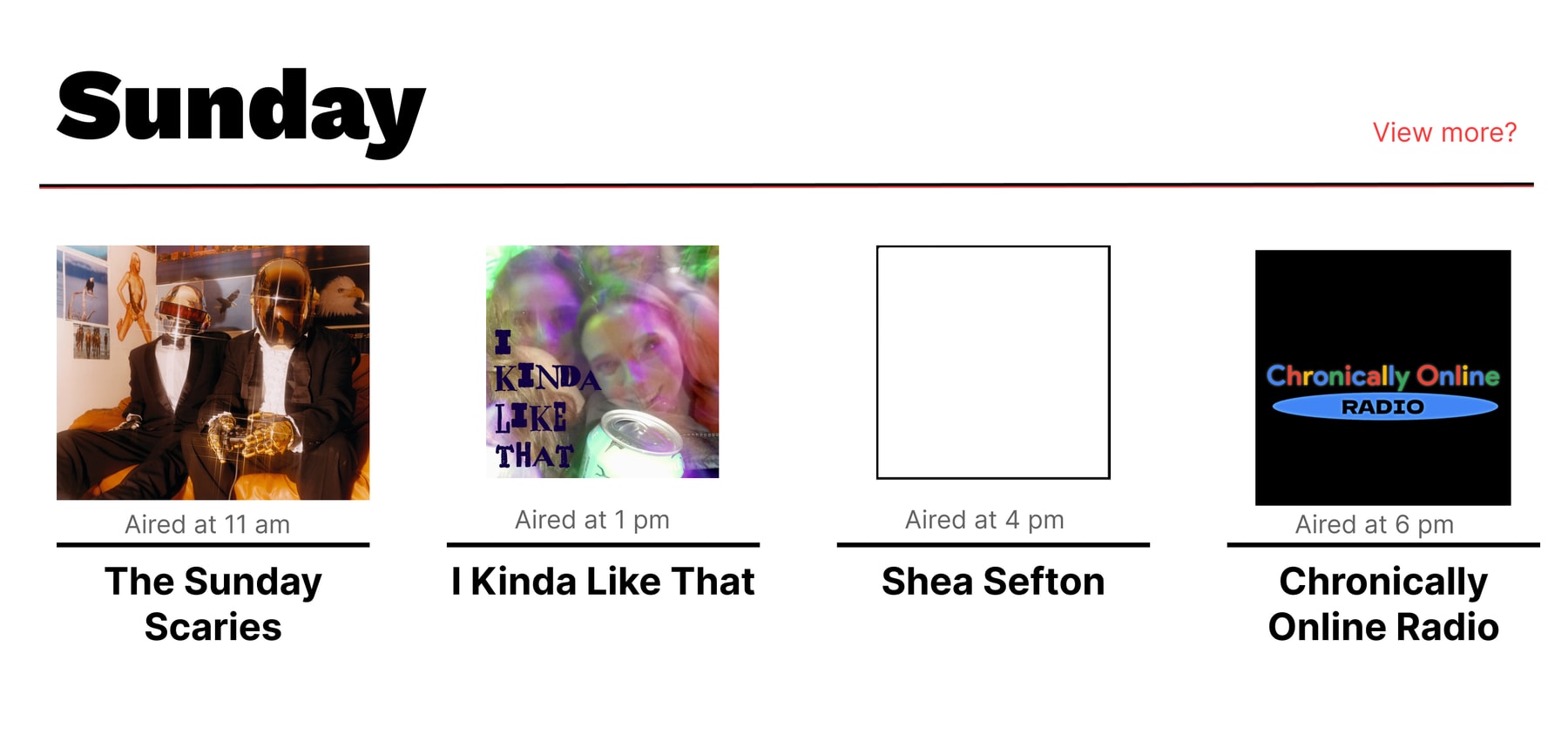
The Shows page needed to display an entire week of radio programming without overwhelming visitors with information.

Leo came up with a collapsible schedule that lets visitors open one day at a time. Each show appears in a compact card with its image, name, and airtime.

Leo Tombragel

Developer spotlight

Leo Tombragel
C/COCA wanted to display all the shows but I came up with the collapsible box to only show relevant info in a condensed manner. I ended up learning a ton and building a page that I was really proud of.
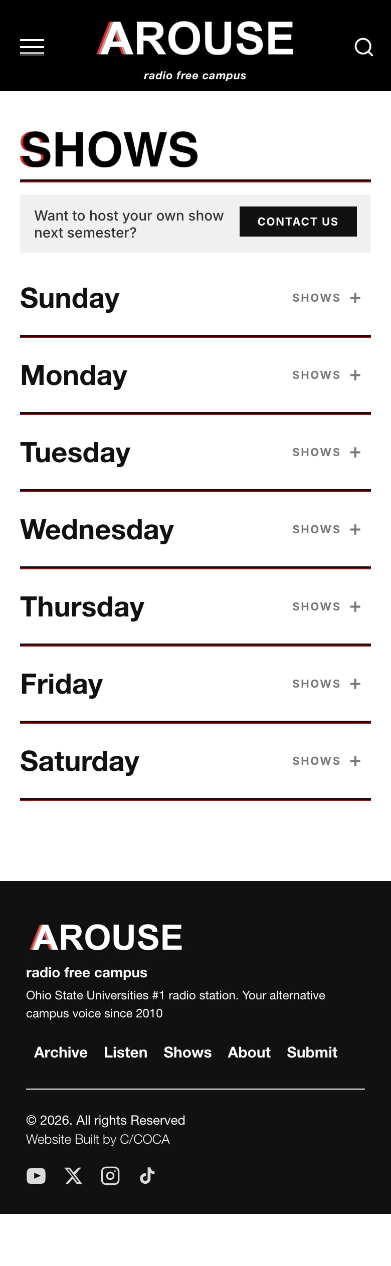
The Shows page on a phone: a SHOWS heading, then Sunday to Thursday rows that each open to their shows.

Radio Player and Mini Player

Jacob developed the Listen page and the mini player that appears throughout the website.

The Listen page has a large play button and displays information about the live stream. The mini player stays available while visitors move between pages, so they don't have to return to the Listen page to control playback.

Jacob also added volume and mute controls, keyboard shortcuts, and checks for connection problems.

Jacob Cook

Developer spotlight

Jacob Cook
I think there’s always a challenge with media players when it comes to balancing usability with maintaining site aesthetics.
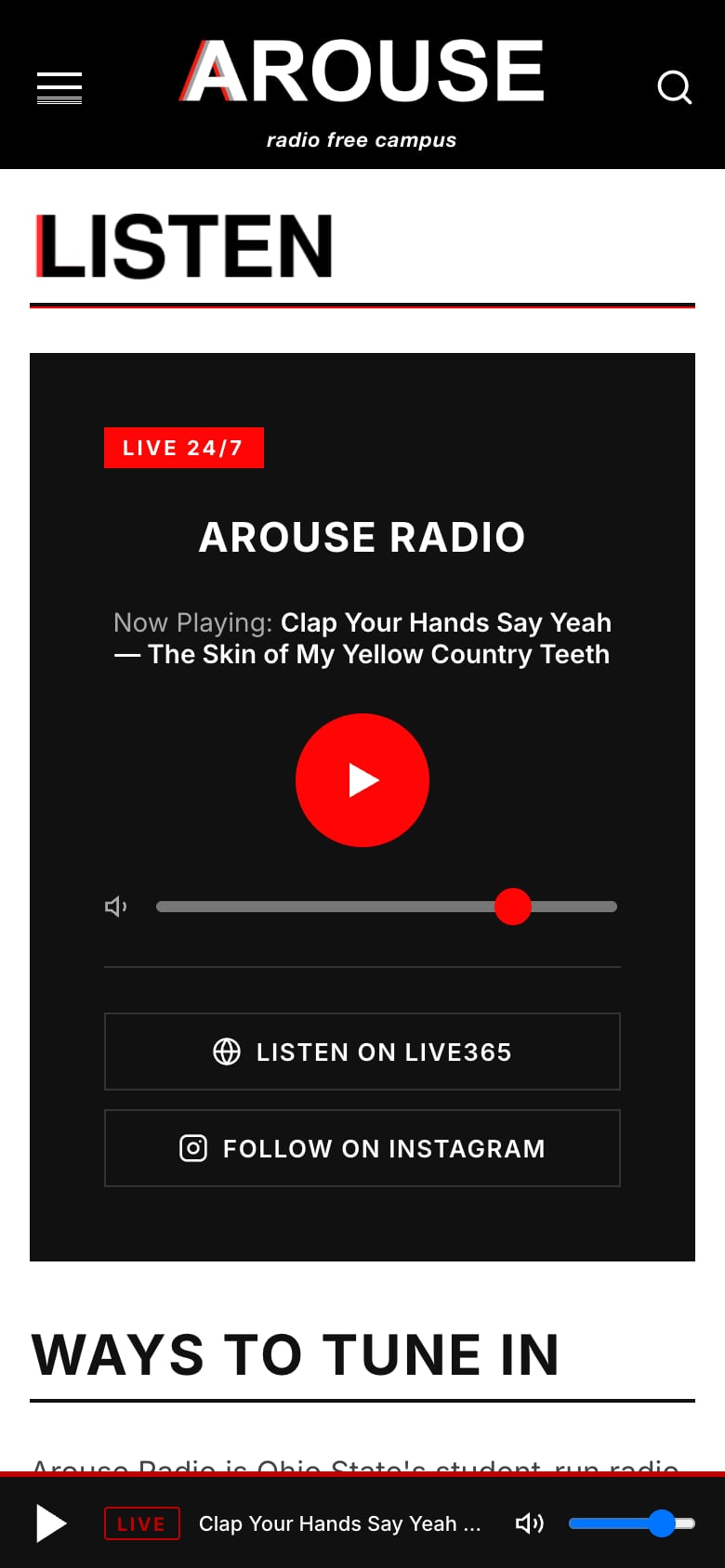
The Listen page on a phone: a LIVE 24/7 label, AROUSE Radio, the current track and a large play button, with the mini player along the bottom.

Behind the Website

Giving AROUSE Control Over Its Content

Redesigning the website was only part of the project. AROUSE also needed a way to manage its content after our team finished building it.

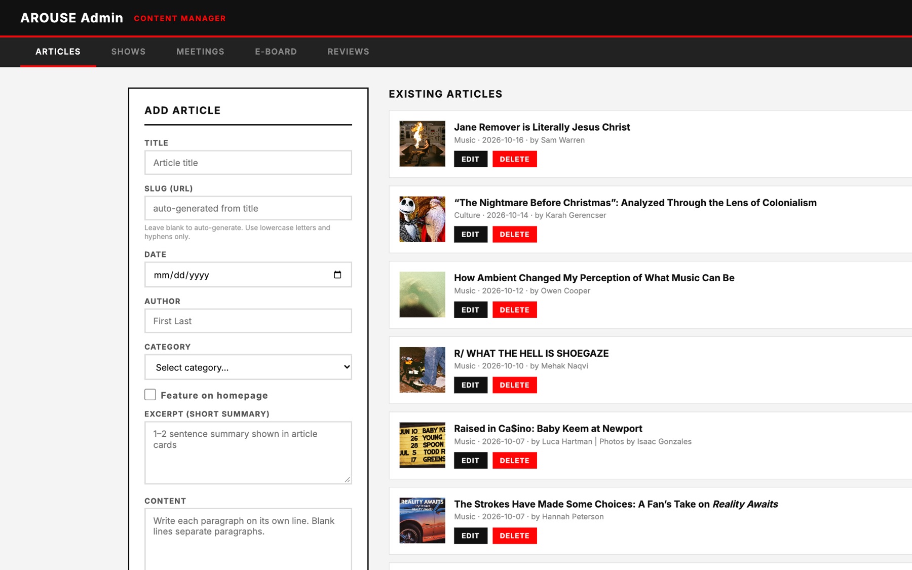
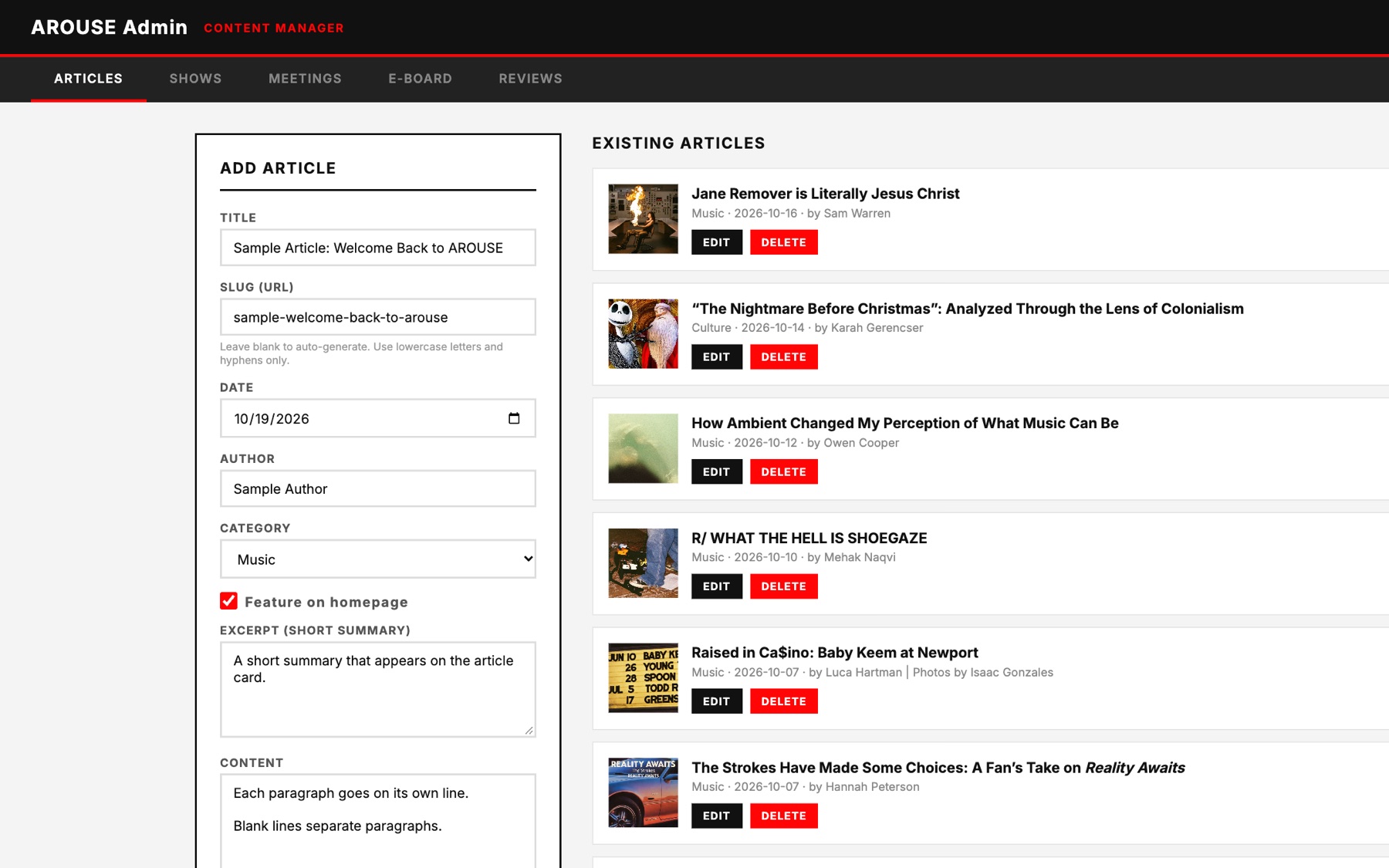
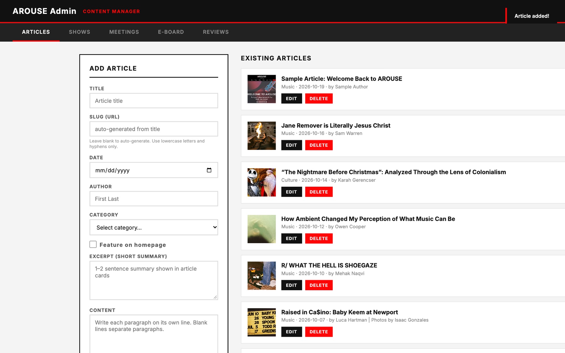
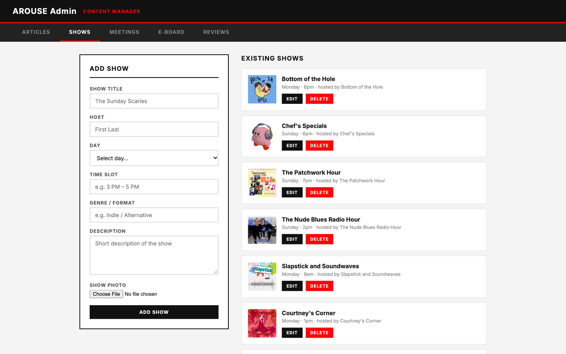
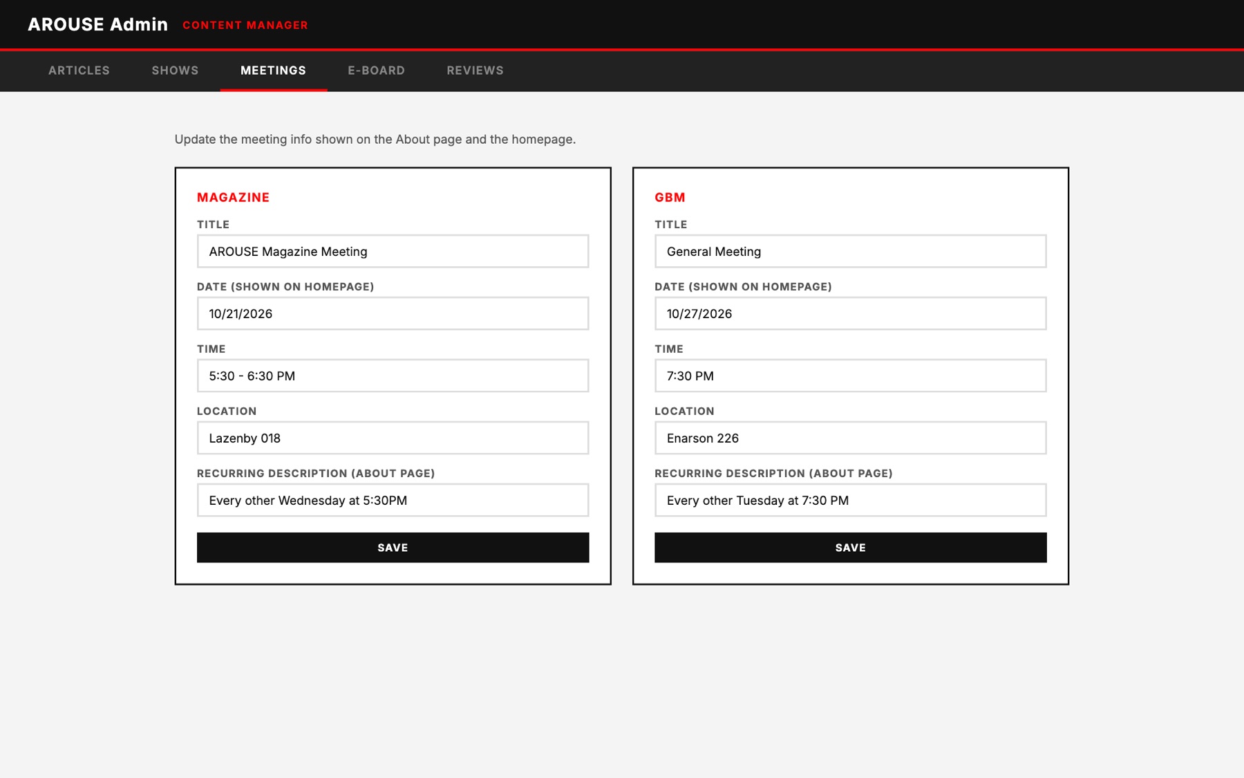
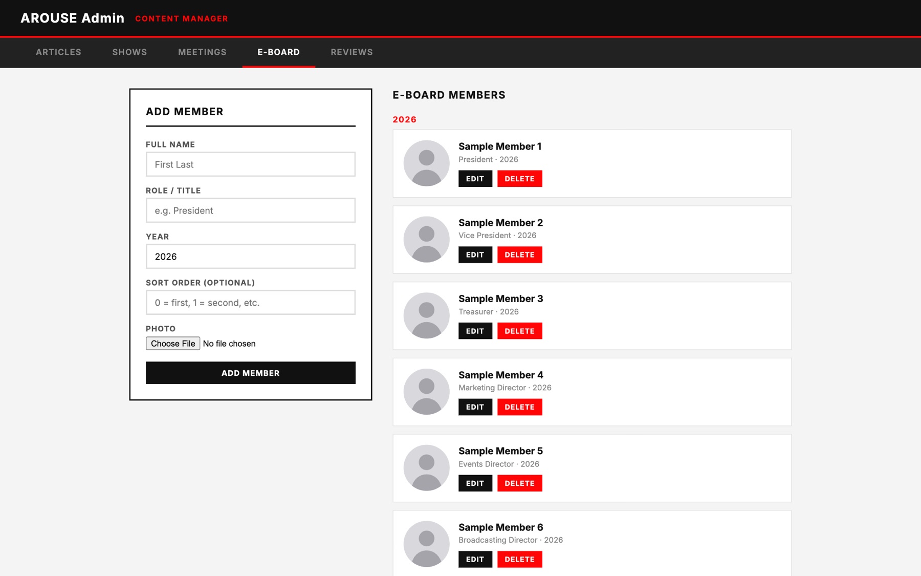
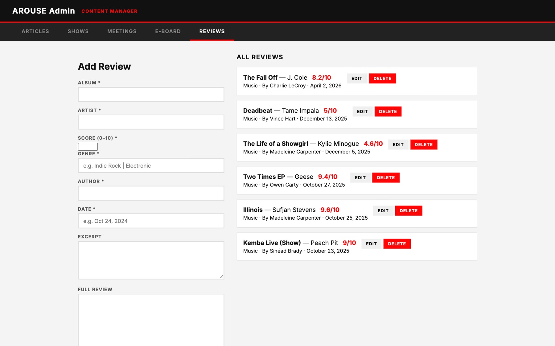
Salma developed a custom admin system so AROUSE's student leaders could make updates without editing the website's code.

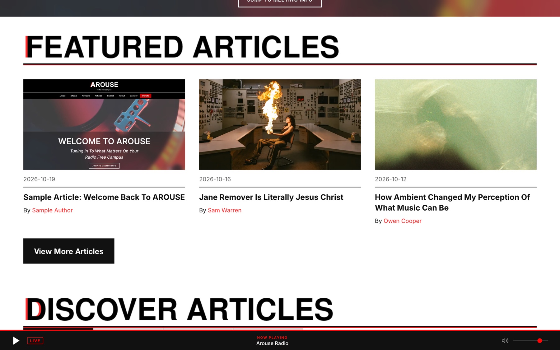
Explore the admin interface to see how content is managed and how those changes appear on the public website.

The AROUSE admin page: a black header with five tabs (Articles, Shows, Meetings, E-Board, Reviews), an empty Add Article form on the left and a list of existing articles with Edit and Delete buttons on the right.

Step 1 of 4

These screens show the real admin page filled with sample content. The article in steps 2 to 4 is a sample and was never published on AROUSE's website.

Admin page
Password-protected
Server
Node.js and Express
Database
Supabase
Website
Updates show up on the public pages
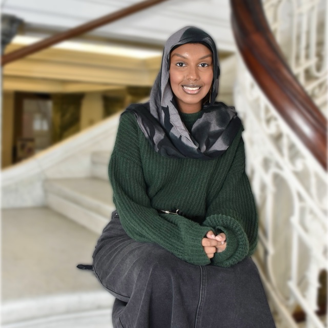
Salma Adem

Developer spotlight

Salma Adem

Developed the admin system, along with the Shows API and the reviews page. Simon Lunay provided code that helped build it.

The Finished Website

Explore the New AROUSE Website

The finished website includes a redesigned homepage, organized article categories, a weekly radio schedule, and a new listening interface.

AROUSE's student leaders can also update content using the custom admin system.

The finished AROUSE homepage: a turntable hero with a welcome message, Featured Articles, Discover Articles with category tabs, a photo slideshow, Next Meeting Details, a Help Us Improve and Grow call to support, and the footer.
The finished homepage on a phone: Welcome to AROUSE, Featured Articles, Discover Articles with category tabs and a mini player.

Visit arouseosu.org

The People Behind the Project

The AROUSE website was designed and developed by students who worked on different parts of the project.

What Came Out of the Project

AROUSE now has a website where its members can publish content, share their radio shows, and provide information about the organization.

The website was completed through the work of student designers and developers, and AROUSE can continue managing it without paying for ongoing development.

Back to home